Directed website redesign and brand evolution for a global nonprofit through culturally-sensitive visual design that transformed community engagement.
Opportunity
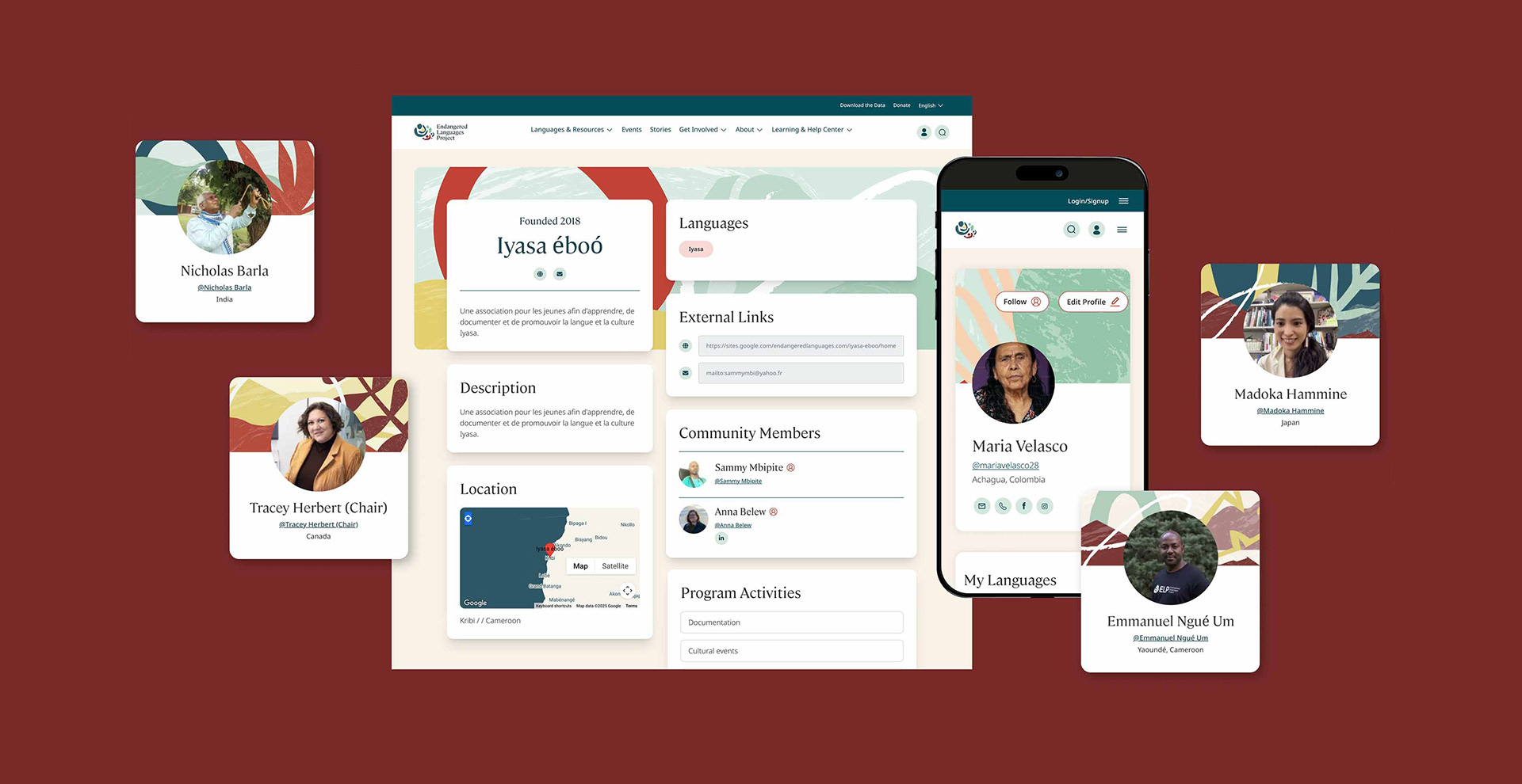
The Endangered Languages Project faced a critical design challenge: how do you create a cohesive visual identity for 3,400+ endangered languages across 87 countries without reductive stereotyping? At the start of the website redesign, ELP had only basic brand identity. As design lead, I directed a comprehensive brand evolution at a pivotal moment as they incorporated as an independent nonprofit. Every visual decision on the new design needed to balance cultural sensitivity with technical feasibility while serving dual audiences: language champions contributing content and funders evaluating organizational credibility. The core opportunity was to transform this minimal brand into a vibrant, modern, and inclusive design system that could increase community engagement, enable fundraising, and authentically reflect the richness and global scope of ELP's mission.
The Endangered Languages Project faced a critical design challenge: how do you create a cohesive visual identity for 3,400+ endangered languages across 87 countries without reductive stereotyping? At the start of the website redesign, ELP had only basic brand identity. As design lead, I directed a comprehensive brand evolution at a pivotal moment as they incorporated as an independent nonprofit. Every visual decision on the new design needed to balance cultural sensitivity with technical feasibility while serving dual audiences: language champions contributing content and funders evaluating organizational credibility. The core opportunity was to transform this minimal brand into a vibrant, modern, and inclusive design system that could increase community engagement, enable fundraising, and authentically reflect the richness and global scope of ELP's mission.
Discovery
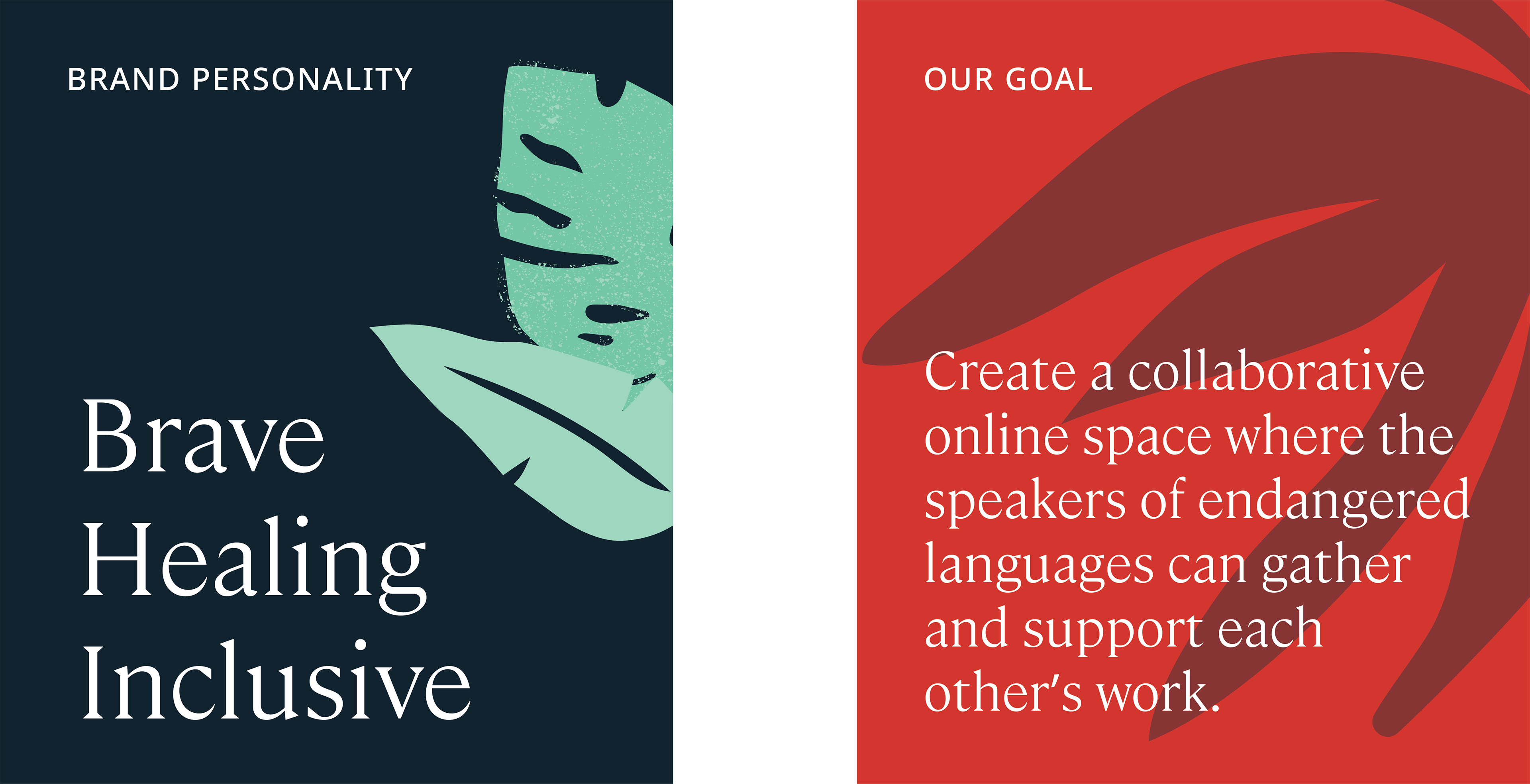
I directed a comprehensive brand evolution from research through implementation, collaborating cross-functionally with technology and strategy experts, while art directing a contract illustrator and production designer. I began by designing and leading a virtual workshop with global stakeholders. Through facilitated dialogue, I gathered perspectives that revealed a critical insight: the visual system needed to create space for stories rather than tell stories on behalf of others, leading to my conceptual foundation—all humans share a connection to landscape and place.

Process
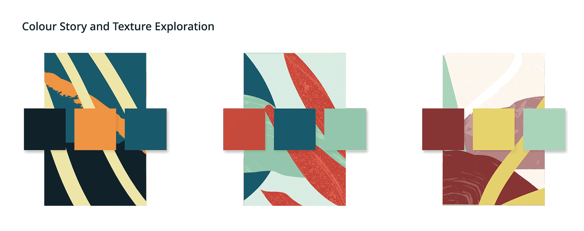
The solution was an illustration library built on organic, abstracted natural elements—rivers, mountains, flora, stars—that evoke a connection to place without prescribing which place. Communities could project themselves into the imagery without being spoken for.
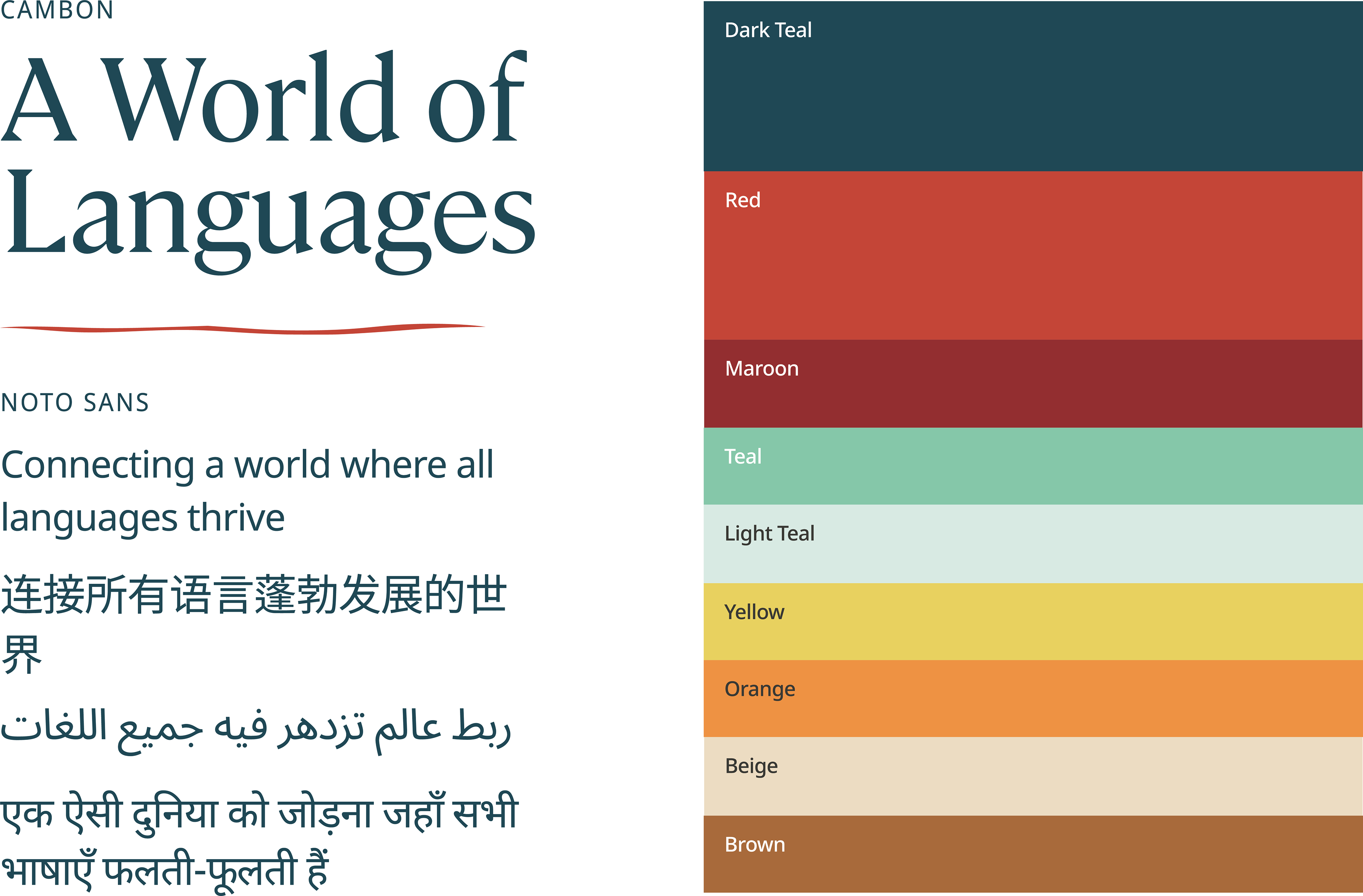
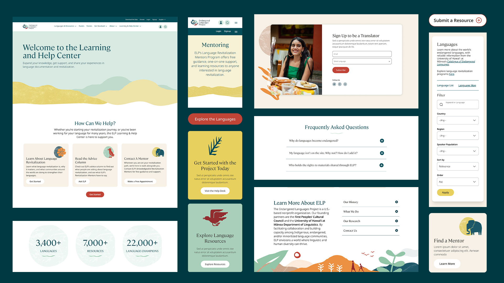
While art directing the illustrator across a library spanning tropical forests to urban landscapes, I simultaneously expanded the brand: earth-toned palette with full accessibility compliance, layered textures for warmth and depth, and a multilingual typeface research process that led to Noto Sans. Throughout, I ran collaborative presentations and formal reviews—keeping global stakeholders in active dialogue so the rationale was understood and their voices stayed in the work.
Outcome
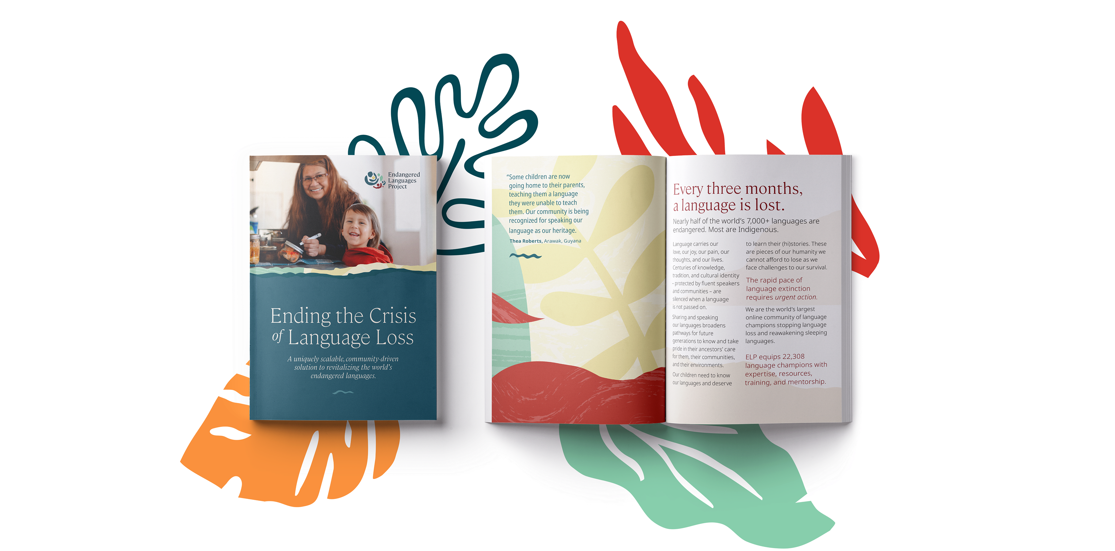
The work didn't end at launch. ELP's continued use of the spot illustrations across their social media reflects a visual system that genuinely took root, one the team could extend on their own without losing coherence. The brand translated beyond the screen as well, with the visual language carried into their annual funding packages for donor and partner outreach. The project was recognized with an award for the design work.
Skills: Art direction, Brand Identity, Website Design
Client: Endangered Language Project
Agency: Constructive
Client: Endangered Language Project
Agency: Constructive