The Dana Foundation’s new digital presence inspires action and fosters lasting connections between the scientific community and the public it serves.
Opportunity
The Dana Foundation is a nonprofit dedicated to exploring the connections between neuroscience and society. Although it held a strong legacy and reputation within academic and scientific communities, there was a disconnect between its mission and how it was perceived by the broader public.
The Dana Foundation is a nonprofit dedicated to exploring the connections between neuroscience and society. Although it held a strong legacy and reputation within academic and scientific communities, there was a disconnect between its mission and how it was perceived by the broader public.

Discovery
During the audit of the previous website, there were key design issues identified, cognitive overload from inconsistent hierarchy and accessibility barriers from poor contrast. The site needed to humanize the Foundation; this was achieved by leveraging relationship-driven content and behind-the-scenes storytelling.
During the audit of the previous website, there were key design issues identified, cognitive overload from inconsistent hierarchy and accessibility barriers from poor contrast. The site needed to humanize the Foundation; this was achieved by leveraging relationship-driven content and behind-the-scenes storytelling.


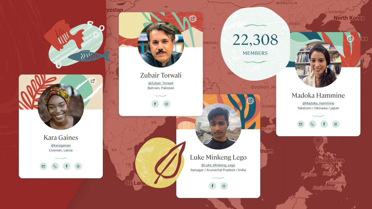
Outcome
The website redesign built on Dana's new logo gradient, using a warm-to-cool tonal shift to convey flow, innovation, and modernity. I employed bold colors strategically to create energetic moments that represent innovation and scientific discovery. Photo collages are masked into brain-inspired shapes, creating distinctive, ownable brand moments and dynamic white space that highlight both scientific precision and human connection. My approach embraced concise, minimalist layouts to ensure the site remains approachable for visitors ranging from casual browsers to domain experts. Typography balances clarity and accessibility with scholarly authority, supporting the site's dual need to welcome diverse audiences while preserving academic rigor.
The website redesign built on Dana's new logo gradient, using a warm-to-cool tonal shift to convey flow, innovation, and modernity. I employed bold colors strategically to create energetic moments that represent innovation and scientific discovery. Photo collages are masked into brain-inspired shapes, creating distinctive, ownable brand moments and dynamic white space that highlight both scientific precision and human connection. My approach embraced concise, minimalist layouts to ensure the site remains approachable for visitors ranging from casual browsers to domain experts. Typography balances clarity and accessibility with scholarly authority, supporting the site's dual need to welcome diverse audiences while preserving academic rigor.

Skills: Art direction, Design system, UI
Client: Dana Foundation
Creative Direction: Karla Despradel
UX Design: Kevin Ng
Agency: Constructive
Client: Dana Foundation
Creative Direction: Karla Despradel
UX Design: Kevin Ng
Agency: Constructive